Color sets the emotional tone of your wedding, it can whisper timeless elegance or shout bold personality. In 2026, we’re seeing a distinct shift in wedding palettes: couples want colors that feel intentional, luxurious, and deeply reflective of their season and style. From richly layered jewel tones to grounded earth-inspired combinations, these palettes aren’t just pretty, they tell a story.
Spring Elegance: Soft with a Statement
Lavender Smoke + Silver Lilac
Spring weddings this year lean into a dreamy cool elegance. This smoky take on lavender isn’t your typical pastel… it feels editorial, modern, and ethereal. Paired with glints of silver and soft greys, it evokes a high-fashion romance that dresses up florals and linens alike.
Icy Blue Quartz + Moonstone Grey
For couples drawn to celestial moments, this palette feels like a whisper of early morning light or a sky just before sunrise. Its cool, surreal tones make everything from stationery to reception decor feel refined and otherworldly.
Why this feels luxurious: Cool tones inherently elevate… they feel calm yet sophisticated, like couture rather than casual.
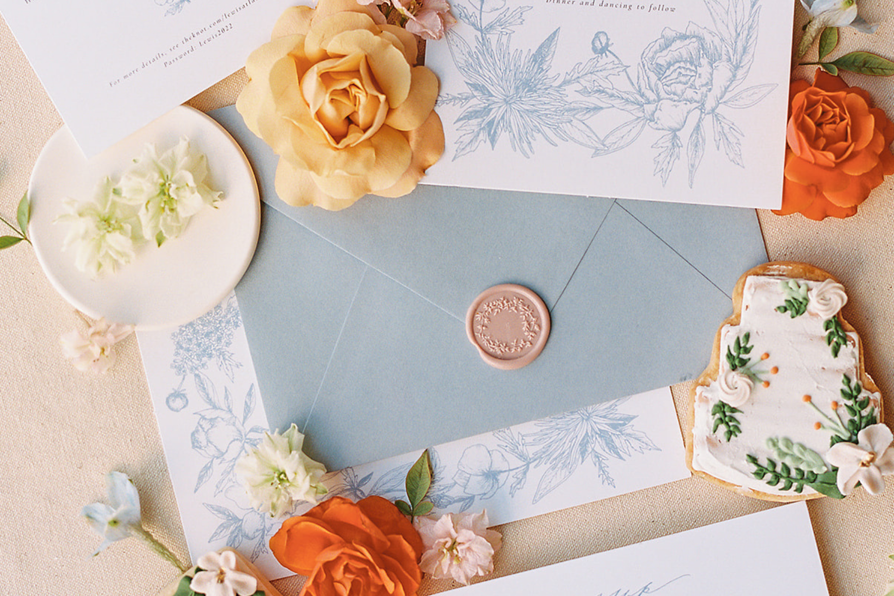
Summer Brights with Luxe Depth
Terracotta Rose + Cinnamon Blush
There’s something deeply grounding about warm terracotta and cinnamon tones. They channel a sun-kissed romance perfect for outdoor ceremonies or vineyard receptions.
Coral + Gold Accents
Playful yet elegant, this trio brings summer energy without compromising sophistication. The gold accents elevate the warmth into something upscale and celebratory.
My take: Summer doesn’t have to be neon or loud, pairing vibrant hues with refined metallics or soft neutrals gives that joyful feel while still keeping a luxe aesthetic.
Autumn Richness | Deep, Natural, Romantic
Emerald Forest + Deep Moss
Earthy jewel tones continue to define luxury in 2026. Deep green tones paired with moss and amber create an environment that feels both botanical and grand, perfect for woodland or vineyard weddings.
Wine & Velvet Luxe (Bordeaux, Velvet Plum, Blush)
This palette feels like a timeless classic reborn. The deep, dramatic tones pair with blush and soft metallics to balance romance with cinema-ready drama.
Why this works: Rich, layered hues carry visual weight, they feel intentional and full of depth, not just beautiful but emotionally resonant.
Winter Glam & Textured Luxe
Vintage Gold + Soft Champagne
When winter weddings call for warmth, this palette answers with understated luxury. Champagne neutrals paired with vintage gold create a regal feel without overwhelming.
Modern Black & White with Metallic Accents
Classic schemes are elevated in 2026 with sleek metallics, gold, silver, or copper bringing a minimalist base into glamorous territory.
My view: Winter palettes shine best when they contrast cool surroundings with warm, gleaming details. Textured textiles, glowing lighting, and luxe metals make these combinations feel immersive and refined.
Emerging 2026 trends Worth Noting
Bold, Editorial Colors
Cobalt blue, a vivid, electrifying hue making waves across fashion and design is now crossing into wedding palettes as a luxurious accent or statement piece.
Nature-Driven, Organic Warmth
“Earthy vibrancy”, a trend rooted in nature and rich tones like deep terracotta, moss greens, and plum, influences both interiors and weddings alike, grounding celebrations in authenticity and warmth.
Unexpected Metallic Pairings
Silver is returning as a luxe complement to warm browns and neutrals, adding contemporary shine without feeling cold or stark.
So, What Makes a Palette Feel ‘Luxury’ in 2026?
Luxury this year isn’t about pastels for their own sake or bright color for entertainment, it’s about intentionality, depth, and emotional resonance. When a palette:
- Echoes natural influences (think forests, deserts, oceans)
- Balances boldness with subtlety (rich hues + soft neutrals)
- Feels cohesive across fashion, florals, and design
- Has personal meaning for the couple
…you have a palette that feels luxurious rather than just trendy.
Ready to find your perfect palette?
Whether you’re planning a celebration steeped in editorial glamour or one grounded in natural beauty, 2026’s color landscape offers something for every couple looking to make a meaningful design statement. If you’re unsure where to start, let’s explore together and find the palette that tells your story.